LE BOA
- Client
- LE BOA
- Category
- Brand Identity
- Role
- Brand StrategyVisual IdentityPackaging Design
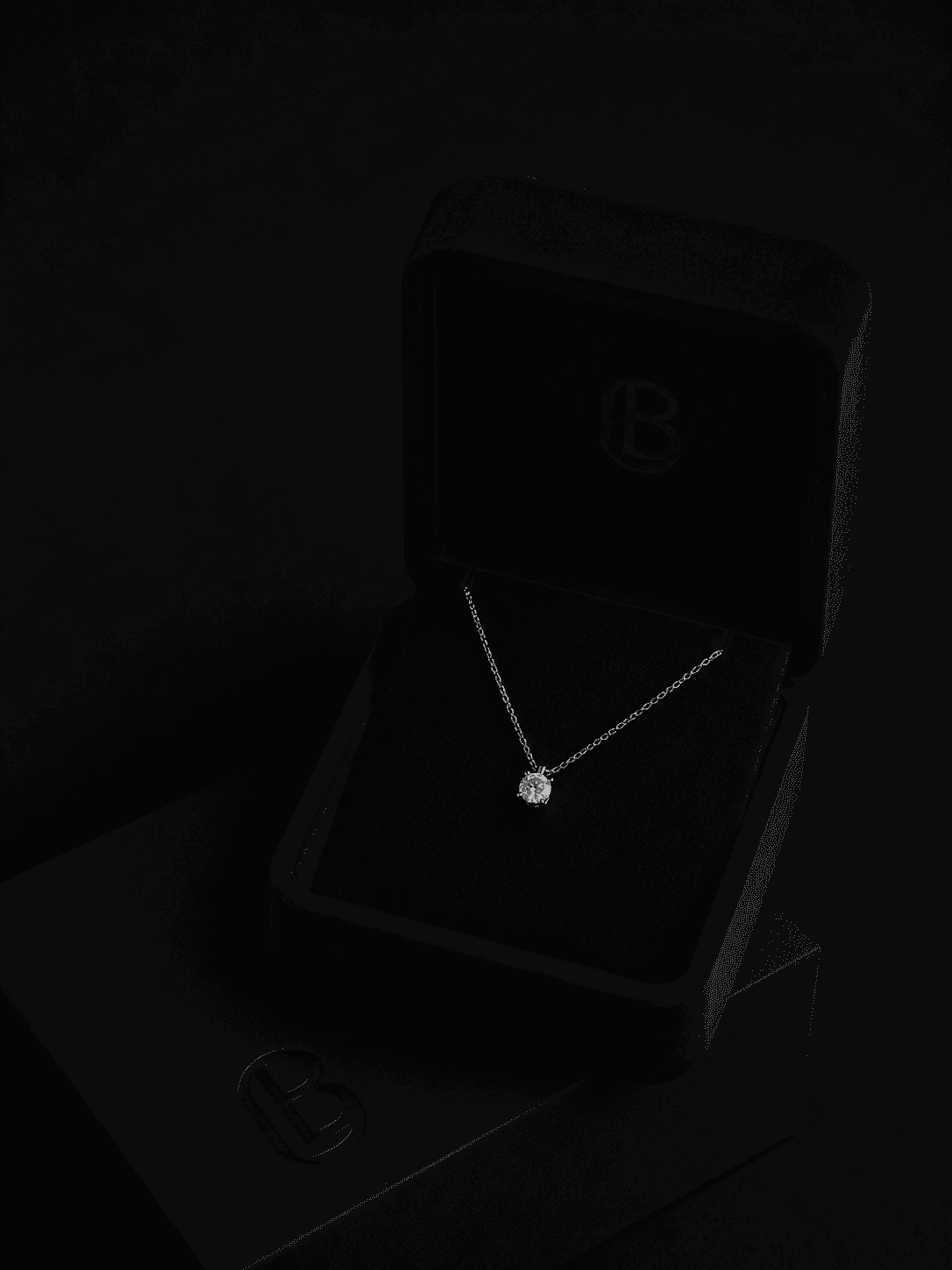
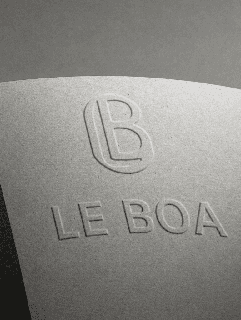
르보아는 파인 주얼리 분야에서 독보적인 이름을 만들고자 했습니다. 장인정신과 절제된 고급스러움을 바탕으로 한 브랜드였지만, 그에 걸맞은 비주얼 아이덴티티가 없었습니다. 우아함, 절제, 오래가는 세련됨을 바탕으로 브랜드 아이덴티티 시스템 전체를 개발했습니다. 심볼은 파인 주얼리 특유의 유려하고 조각적인 느낌에서 출발해 정교하면서도 유기적입니다. 서체는 품격 있는 인상을 기준으로 골랐고, 시각 언어는 유행보다 오래가는 아름다움을 추구하는 브랜드답게 희소성과 친근함 사이의 균형을 잡았습니다.
Le Boa came to us with a clear vision: to establish themselves as a distinguished name in fine jewellery. A brand built on craftsmanship and quiet luxury, yet without a visual identity to match. We developed a complete brand identity system rooted in elegance, restraint, and enduring sophistication. The mark draws from the fluid, sculptural quality of fine jewellery itself — precise yet organic. Typography was chosen for its refined character, while the visual language balances exclusivity with approachability, reflecting the brand's commitment to timeless beauty over trend.